Interactive Pharmacy Label Decoder
Prescription bottles often use visual cues to highlight critical safety information. Click on the stickers below to decode their meaning and learn what action you should take.
SUBSTANCE
DROWSINESS
FOOD
REQUIRED
to view its specific safety instructions.
You’ve just picked up a new prescription. The pharmacist hands you a bottle with a label that looks like it was designed by a committee of accountants. Small text, dense paragraphs, and maybe a bright orange sticker that makes your heart skip a beat. It is easy to feel overwhelmed. You are not alone in this confusion.
For years, pharmacy labels have been a wild west of design choices. One pharmacy uses bold, clear fonts; another squeezes tiny text into every available pixel. This inconsistency is not just an annoyance-it is a safety hazard. Misreading a label can lead to taking the wrong dose, mixing up medications, or missing critical warnings about side effects. That is why regulations are finally catching up to reality.
The Shift Toward Standardized Labeling
If you think your local pharmacy’s label is confusing, you are right. For decades, there was no nationwide standard for how prescription bottles should look. The Food and Drug Administration (FDA) federal agency responsible for protecting public health by regulating food, drugs, and medical devices only mandated basic information like your name and dosage. Everything else? Up to the pharmacy chain, the state, or even the individual pharmacist’s preference.
This variability created a perfect storm for errors. The United States Pharmacopeial Convention (USP) non-governmental organization that sets standards for medicines and other healthcare products recognized this problem early. In November 2012, they released General Chapter <17>, which established universal standards for prescription container labeling. The goal was simple: create a "patient-centered" layout that reflects how people actually read and understand instructions.
While USP standards were voluntary at first, they set the stage for bigger changes. Now, we are seeing a pivotal shift with the FDA’s proposed Patient Medication Information (PMI) rule regulatory framework aimed at standardizing how prescription drug labels communicate safety info. This rule aims to replace the cluttered, inconsistent labels with a single-page, standardized format. The focus? Essential instructions and safety information, presented clearly. Implementation is expected by 2025, meaning the labels on your next refill might look very different from the ones you got last year.
Decoding the Warning Stickers
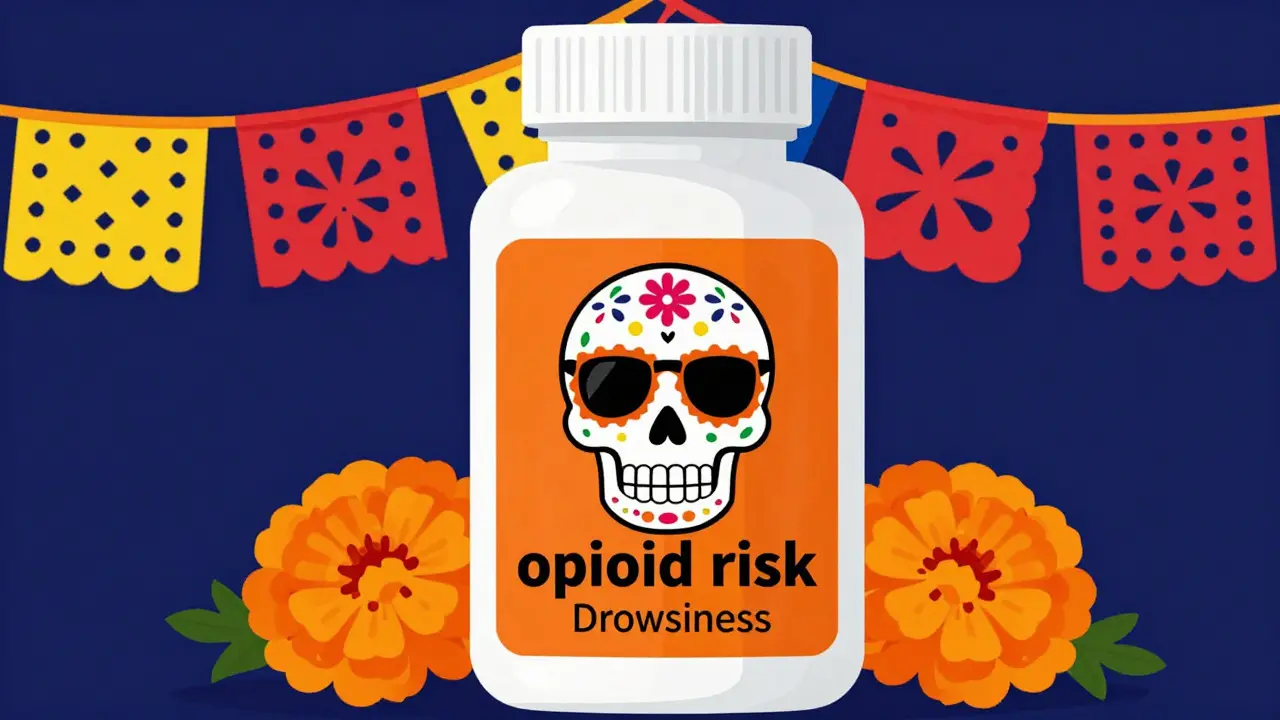
Have you ever seen a bright fluorescent orange circle on a prescription bottle? If you live in Connecticut, or if your pharmacy follows strict state guidelines, you likely have. These are not random decorations. They are mandatory warning labels.
As of January 1, 2024, Connecticut law requires all controlled substance and opioid prescriptions to carry a specific warning label. The specs are precise: a fluorescent orange sticker, exactly 1 1/4 inches in diameter. Other states are following suit. According to the National Alliance for Model State Drug Laws, 27 states now have some form of mandated opioid warning labels. This trend is driven by the ongoing opioid crisis and the need to alert patients immediately to the risks of addiction and overdose.
| Label Type | Visual Cue | Meaning / Action Required |
|---|---|---|
| Opioid Risk | Fluorescent Orange Circle (CT) or Red Box | High risk of addiction/overdose. Store securely. Do not share. |
| Drowsiness Warning | Yellow Triangle or Text | May impair driving or operating machinery. Avoid alcohol. |
| Refrigerate | Blue Snowflake Icon | Must be kept cold to maintain potency. Check storage temp. |
| Takes With Food | Fork/Knife Icon or Text | Take during or after a meal to reduce stomach upset. |
These stickers serve as visual anchors. When you are tired, stressed, or managing multiple meds, your brain scans for these cues. They are designed to interrupt your autopilot and force you to pay attention to critical safety data.
Typography and Readability: Why Font Size Matters
It sounds trivial, but font size is a life-saving detail. Older adults, in particular, struggle with small print. An AARP survey from 2023 found that 68% of adults aged 65+ have difficulty reading standard prescription labels due to small fonts or poor contrast. This is not just about convenience; it is about preventing dangerous mistakes.
New technical specifications are addressing this head-on. Standards now mandate sans-serif typefaces for key information. Why? Because serif fonts (the ones with little feet on the letters) can blur together when printed small. Sans-serif fonts are cleaner and easier to distinguish. The minimum font size for essential information is now often set at 6 points, with warning text required to be 8 points or larger. Specific spacing rules also apply to prevent lines of text from running into each other.
Color contrast is equally important. Black text on a white background is standard, but for warnings, high-contrast colors like red on white or black on yellow are used. This helps patients with visual impairments or those who are color-blind to still perceive the urgency of the message.
The Role of Barcodes and Technology
You probably don’t think about the barcode on your pill bottle, but it is doing heavy lifting behind the scenes. Under federal regulations (21 CFR Part 201), barcodes are mandatory on all prescription labels. But not just any barcode will do.
Pharmacies use GS1 DataMatrix and Code 128 barcodes. These encode crucial data: the National Drug Code (NDC), lot numbers, and expiration dates. When you pick up your meds, the pharmacist scans this code. Automated verification systems then check the scan against your prescription record. If the barcode doesn’t match the expected drug, the system flags it. This catches errors before the bottle ever reaches your hand.
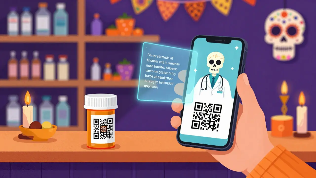
Print quality matters here too. Barcodes must meet Grade C or higher print quality standards. A smudged or poorly printed barcode can fail to scan, causing delays or forcing a manual override, which introduces human error back into the process. As technology advances, we are starting to see QR codes appear on labels too. A March 2024 survey noted that 18% of prescription labels now include QR codes linking to video instructions. Imagine scanning a code to watch a short clip showing exactly how to use an inhaler or apply a topical cream. This bridges the gap between written instructions and practical understanding.
Challenges for Patients with Limited English Proficiency
Standard English labels are not enough for everyone. In California, a 2021 survey revealed that 47% of patients with Limited English Proficiency (LEP) reported difficulty understanding medication instructions on standard labels. This is a massive safety gap.
To address this, some states and pharmacies are adopting multilingual requirements. California’s Board of Pharmacy has published translations of common pill directions and sample patient-centered labels. The idea is to provide instructions in the patient’s primary language whenever possible. However, space on a bottle is limited. This is where the PMI rule’s focus on clarity and conciseness becomes vital. By stripping away jargon and using plain language, labels become easier to translate and understand across different literacy levels.
What You Can Do Today
Until all pharmacies fully adopt the new standardized labels, you can take steps to protect yourself. Here is a quick checklist:
- Ask for Clarification: If the label is unclear, ask the pharmacist to write out the instructions in large, simple terms. Most pharmacists welcome this interaction.
- Check the Warnings: Look for any colored stickers or bold text. These highlight critical risks like drowsiness, interactions with alcohol, or storage needs.
- Verify the Barcode: Ensure the barcode is present and legible. It is part of the safety net.
- Use Pill Organizers Wisely: If you manage multiple meds, consider using a weekly organizer. Transfer pills carefully, but keep the original bottles nearby for reference until you are confident in your routine.
- Leverage Technology: If your label has a QR code, scan it. Video tutorials can be incredibly helpful for complex devices like insulin pens or nebulizers.
Medication errors are a leading cause of hospital visits. But they are largely preventable. By understanding what is on your label and asking questions when something seems off, you become an active partner in your own healthcare. The industry is moving toward clearer, safer labels, but until that transition is complete, your vigilance is the most important tool you have.
Why are pharmacy labels changing in 2025?
The FDA is implementing the Patient Medication Information (PMI) rule to standardize prescription labels. This change aims to reduce medication errors by creating a consistent, easy-to-read format that highlights essential instructions and safety warnings, replacing the current patchwork of designs that vary by pharmacy and state.
What does the orange sticker on my prescription mean?
A fluorescent orange sticker, particularly one measuring 1 1/4 inches in diameter, typically indicates a controlled substance or opioid. Mandated in states like Connecticut since January 2024, it warns of the high risk of addiction and overdose. Always store these medications securely and never share them with others.
Are pharmacy labels required to be in my native language?
Federal law does not currently require labels to be in languages other than English. However, some states like California encourage or require multilingual options for patients with Limited English Proficiency. You can always ask your pharmacist for translated instructions or verbal clarification.
Why is font size important on prescription labels?
Small font sizes contribute significantly to medication errors, especially among older adults. New standards mandate minimum font sizes (e.g., 6-point for general text, 8-point for warnings) and high-contrast colors to ensure readability. Clear text helps patients accurately follow dosage instructions and recognize critical safety alerts.
What information is encoded in the barcode on my pill bottle?
The barcode contains the National Drug Code (NDC), lot number, and expiration date. Pharmacies scan this code to verify that the correct medication is being dispensed to the correct patient. This automated check is a critical step in preventing dispensing errors.